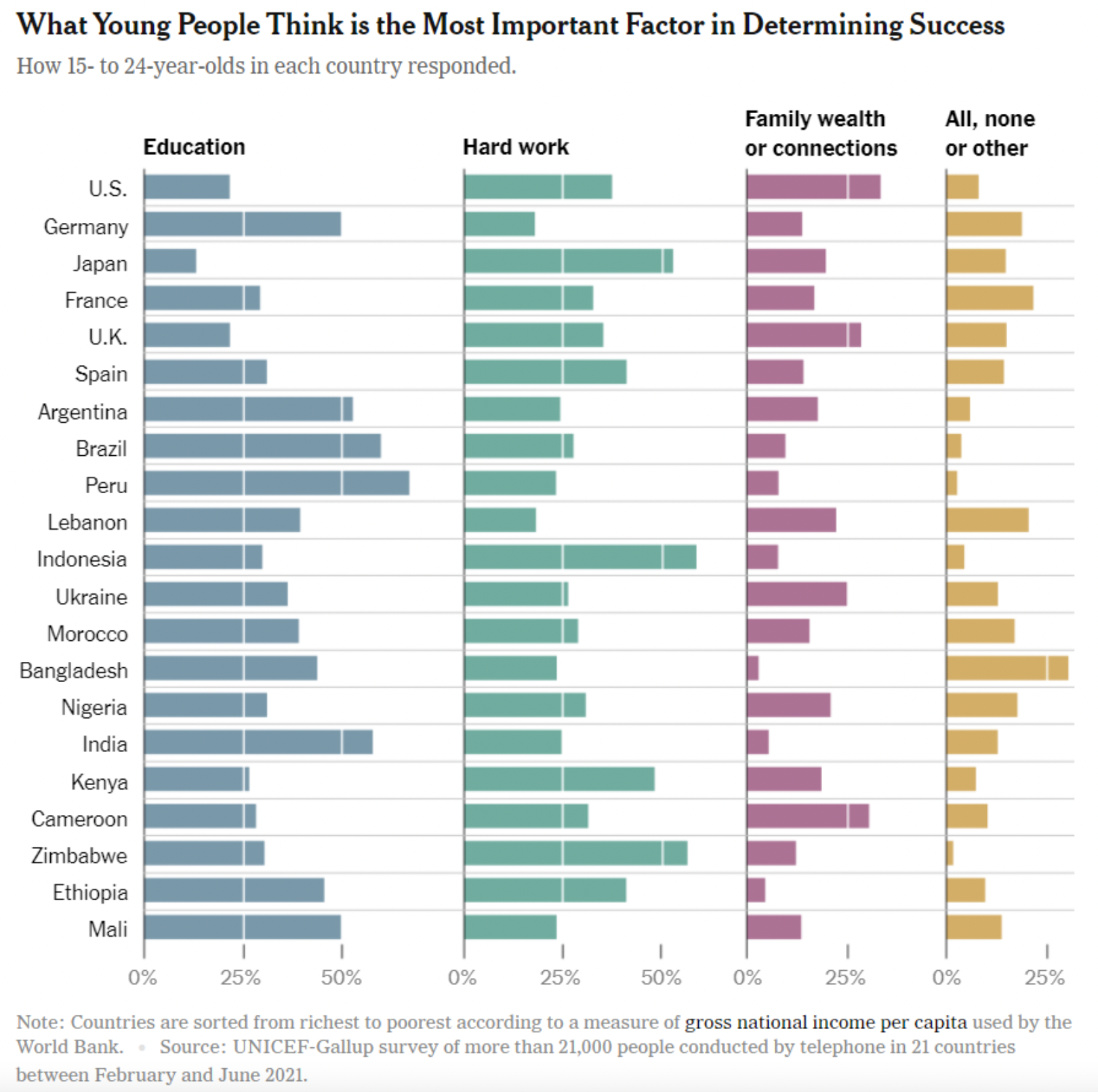
Data Viz Considerations
Grayson White
Math 241
Week 1 | Spring 2026
Background
Leland Wilkinson wrote a book called “The Grammar of Graphics”

As part of his PhD in Statistics at Iowa State, Hadley Wickham wrote the R package ggplot2, which we will use to create static graphs.
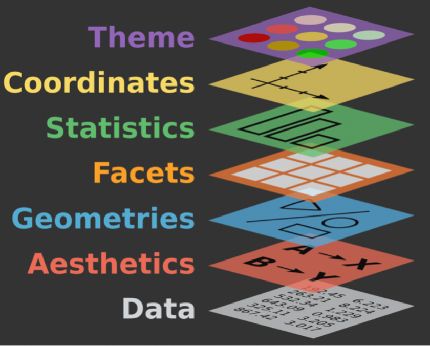
The Grammar of Graphics
data: dataset that contains the data
geom: geometric shape that the data are mapped to
- point, line, bar, text, …
aesthetic: visual properties of the geom
- x position, y position, color, fill, shape
coord: coordinate system
- Cartesian, polar, geographic
scale: controls how data are mapped to the visual values of the aesthetic
- EX: particular colors, linear
guide: legend to help user convert visual display back to the data
Geoms versus Names
- What are the names of these graphs?
- Focus on the shapes (i.e. geoms) and how the variables are mapped to those shapes.
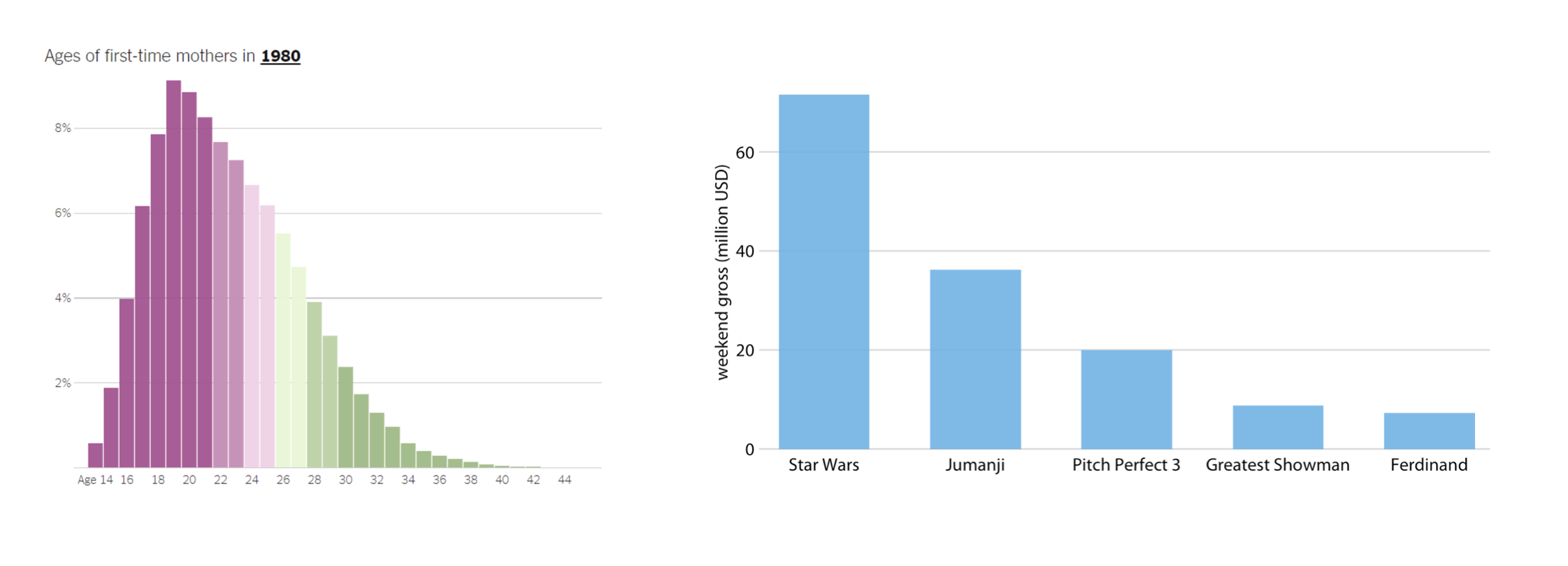
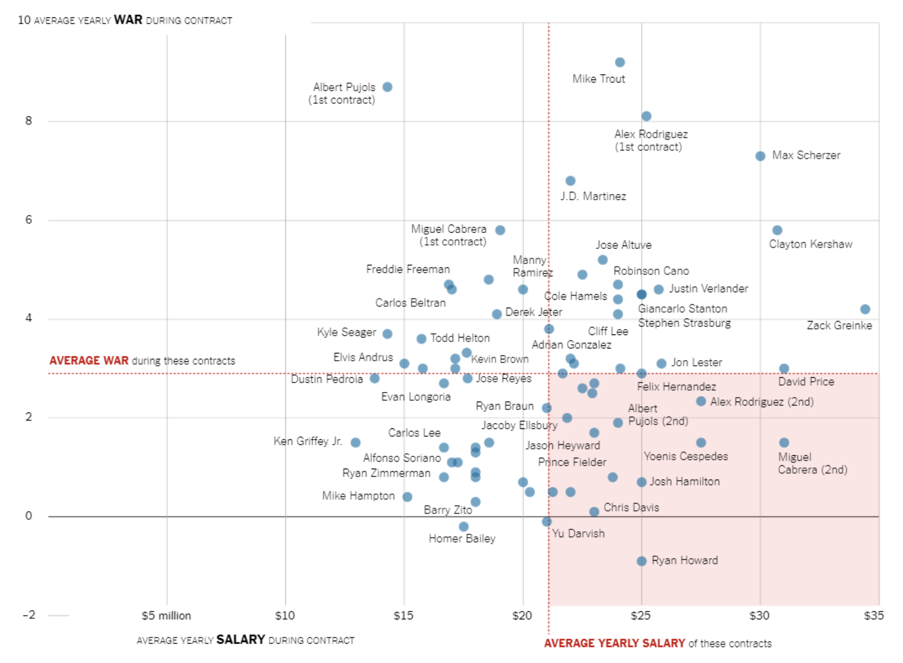
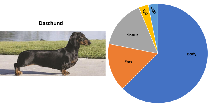
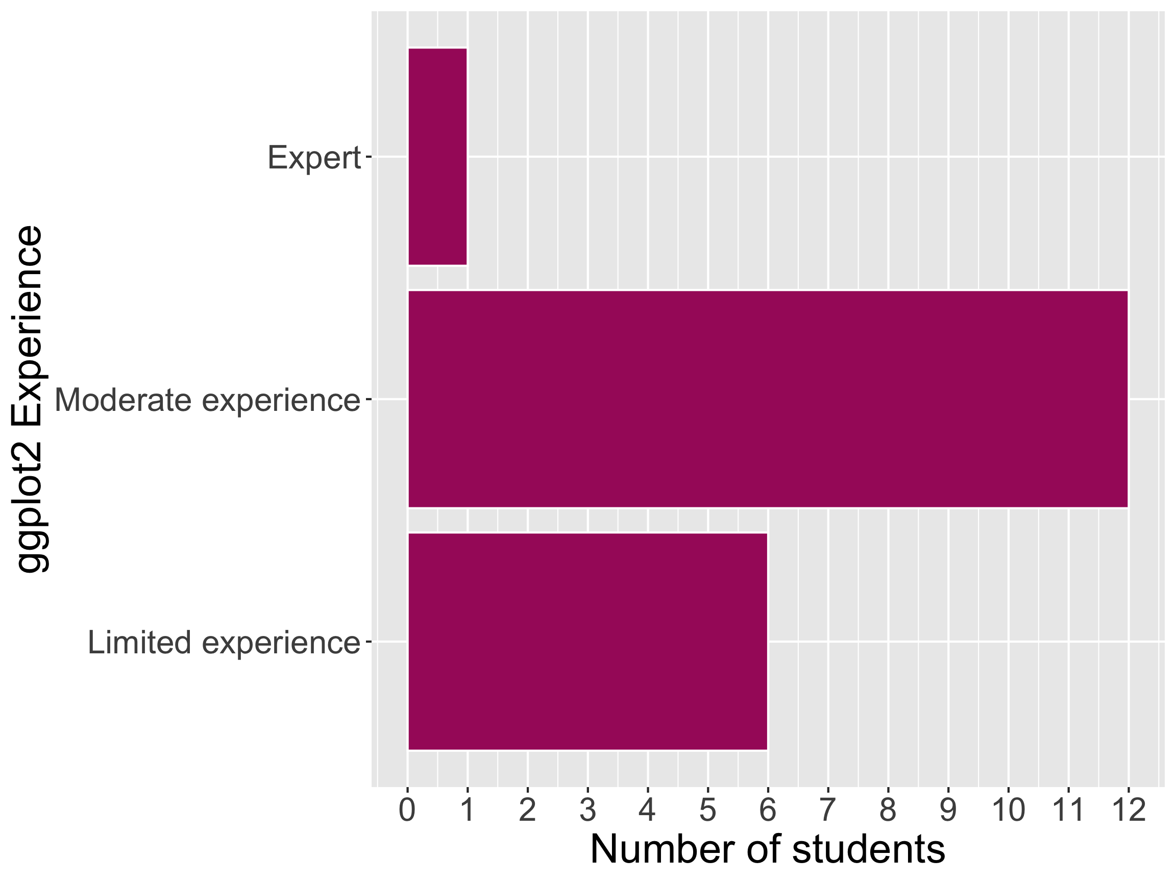
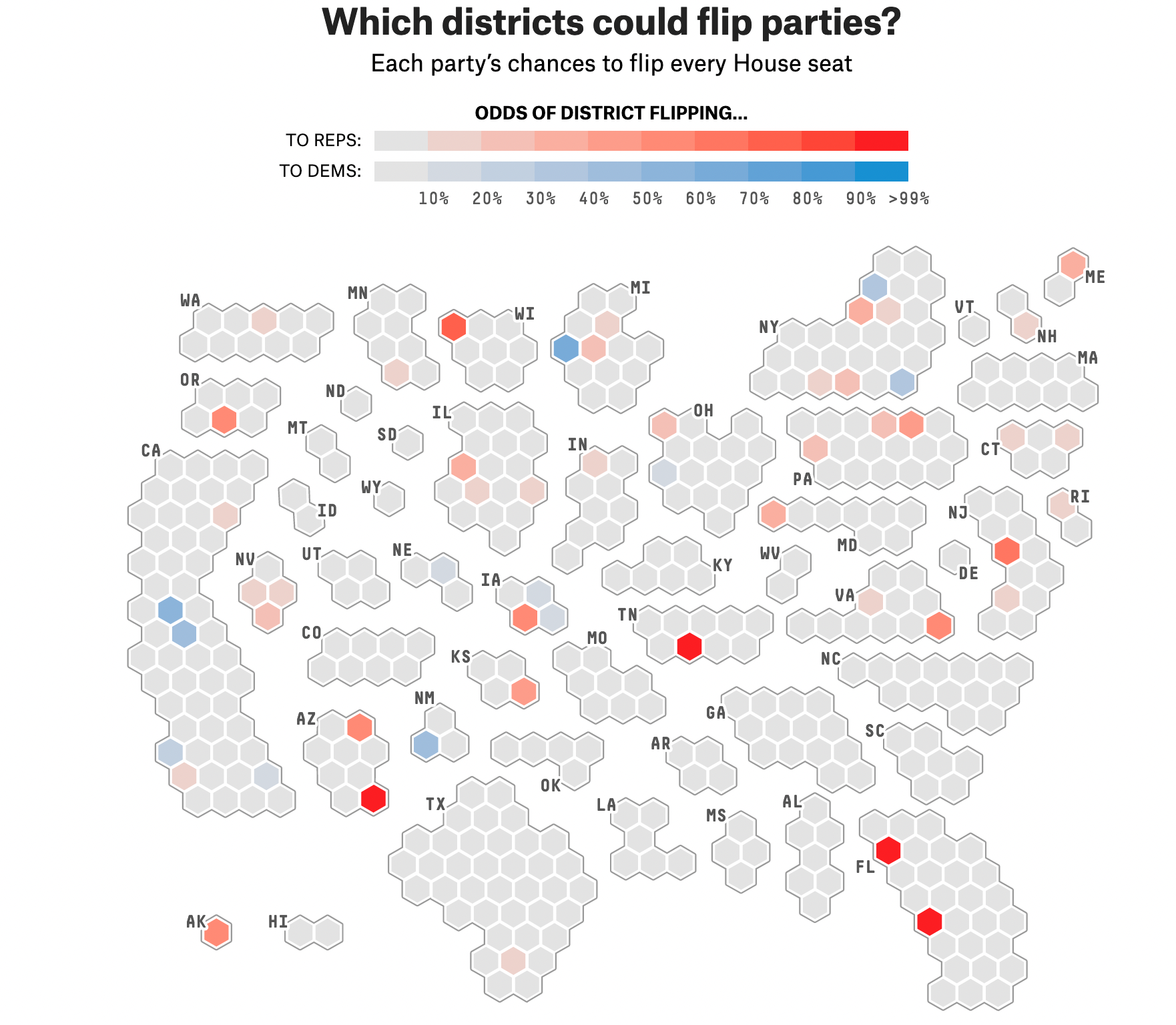
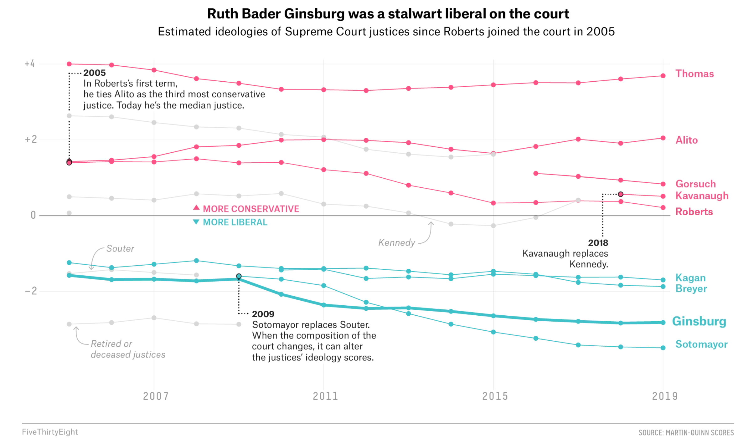
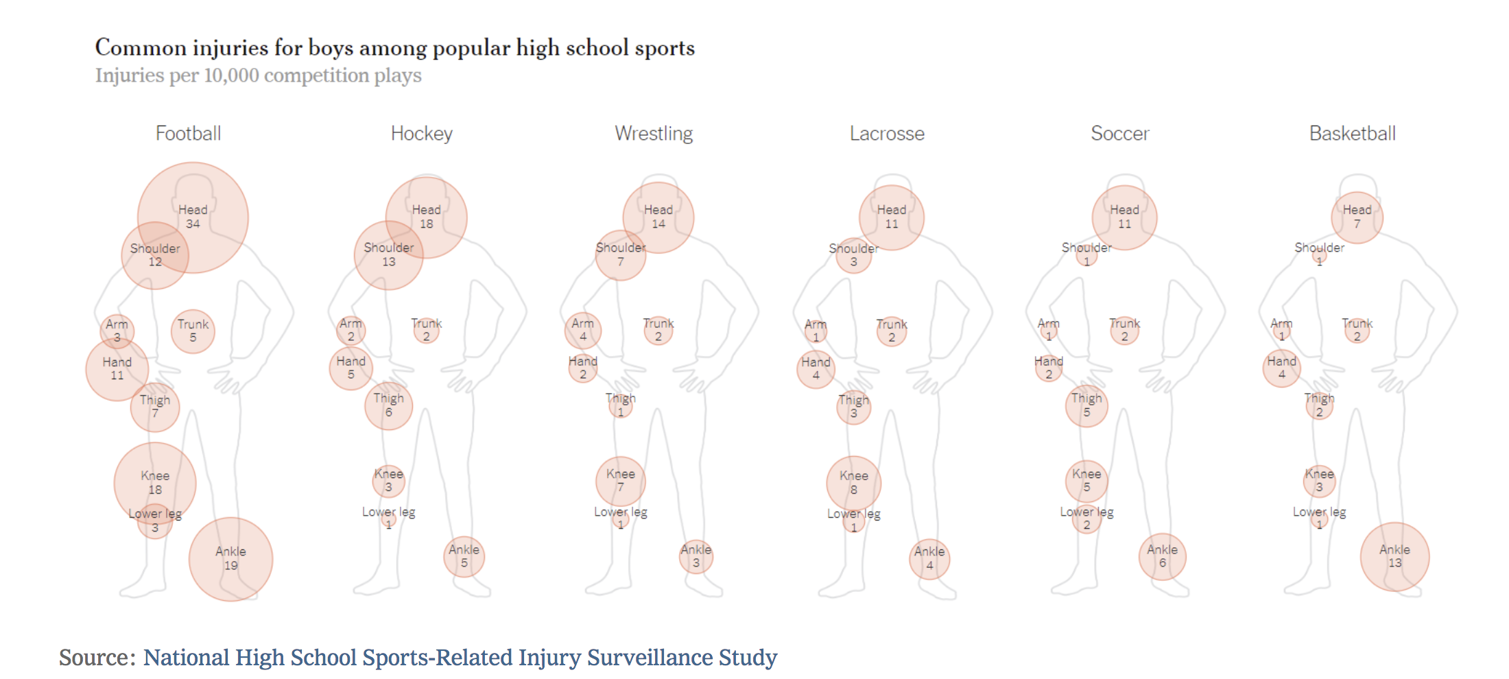
Data Viz Example
Let’s practice deconstructing this graph using the grammar of graphics.
- Geom(s)?
- Aesthetics of the geom?
- Mapping of variables?
- Coord?
- Scales?
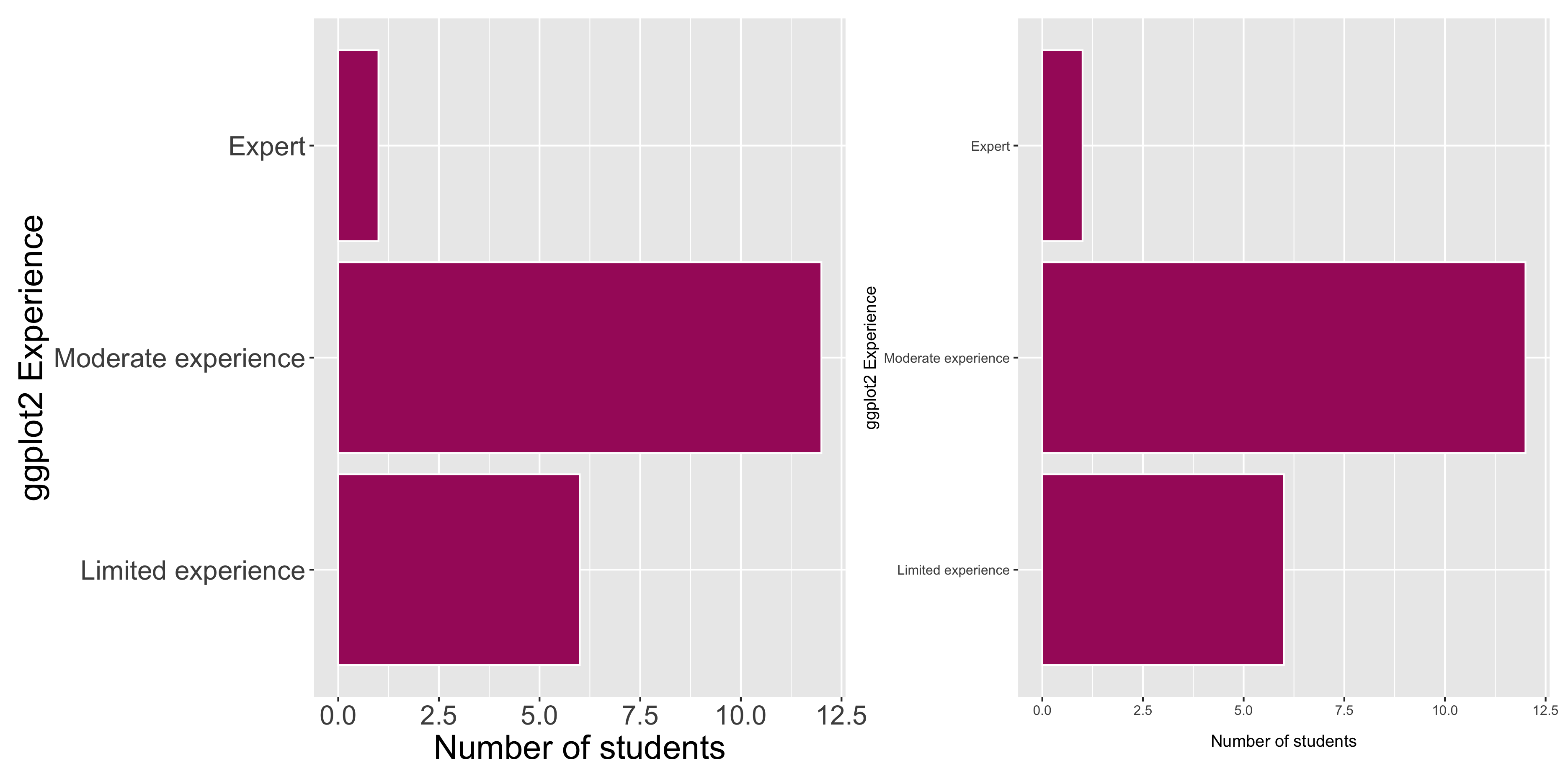
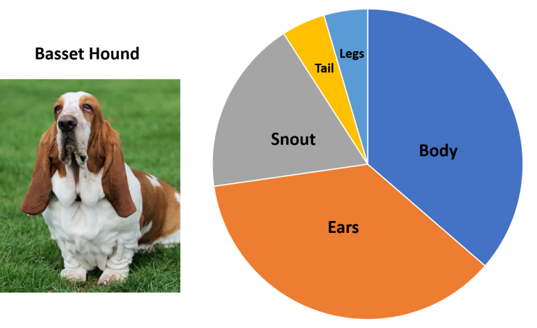
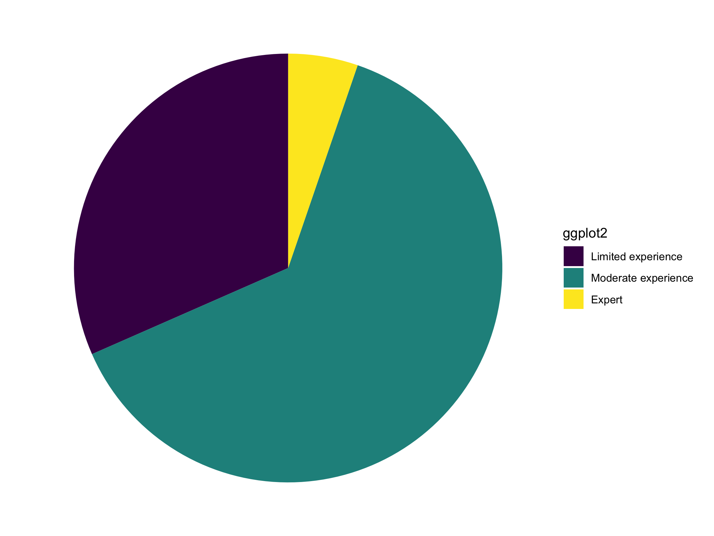
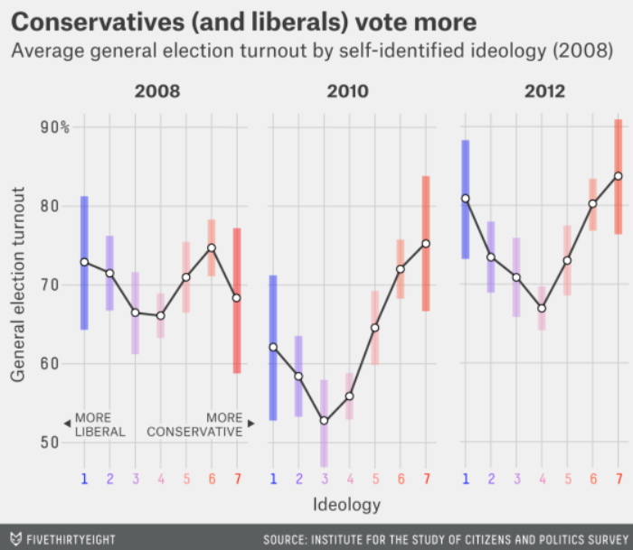
Data Viz Example
Let’s practice deconstructing this graph using the grammar of graphics.
- Geom(s)?
- Aesthetics of the geom?
- Mapping of variables?
- Coord?
- Scales?
What aesthetic options do I have at my disposal?
Aesthetics: Position/location
Aesthetics: Length
Aesthetics: Area
Aesthetics: Angle
Aesthetics: Shapes
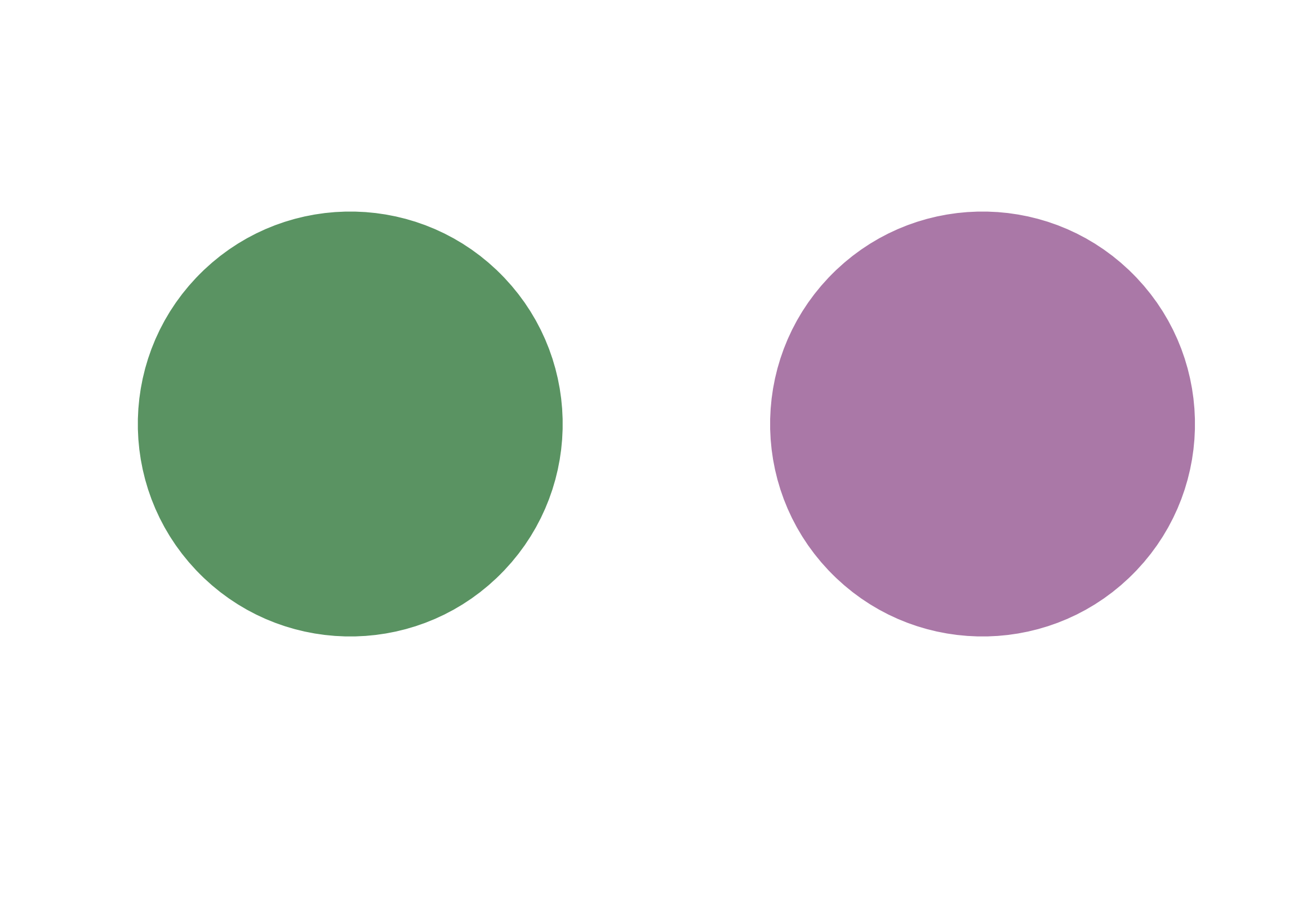
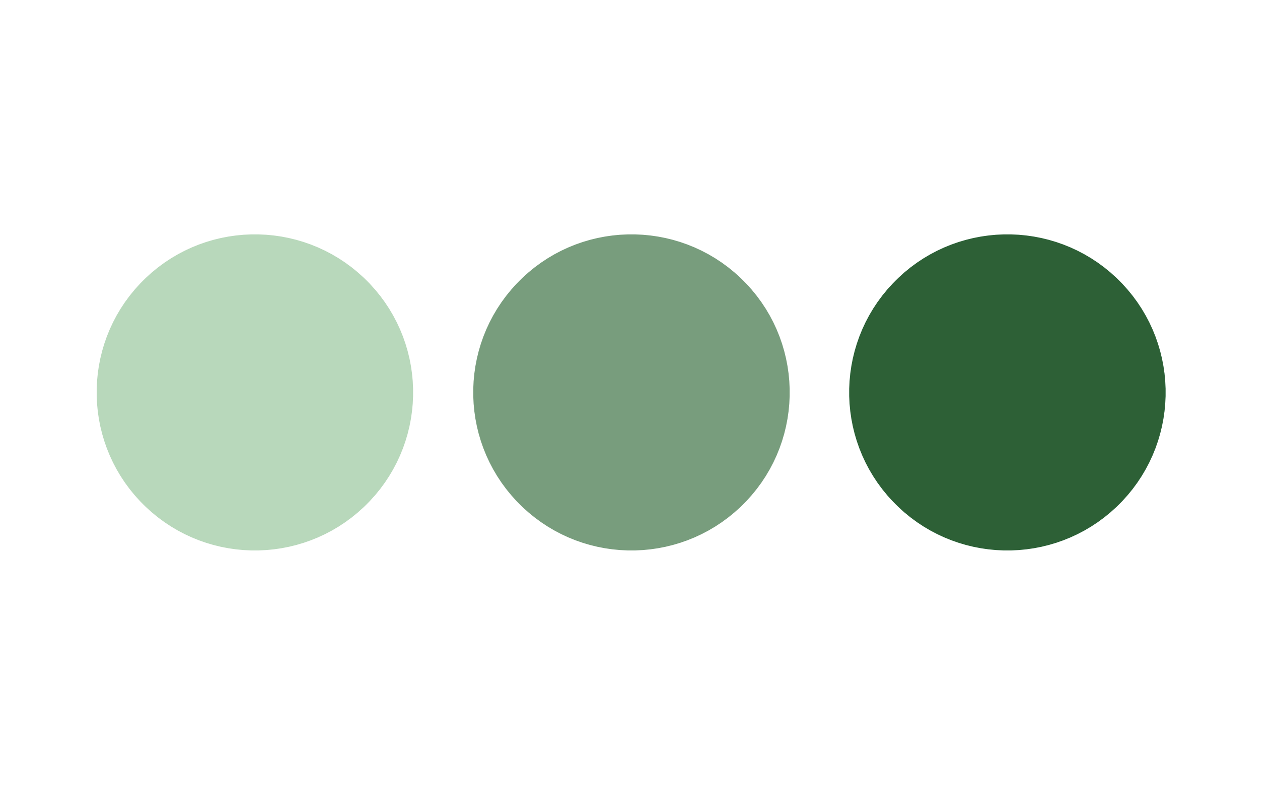
Aesthetics: Color Shade
Aesthetics: Color Hue
Which represents the larger value?

Which represents the larger value?

Which represents the larger value?

Which represents the larger value?

Which represents the larger value?
Which represents the larger value?
Consideration: Consider variable type when picking the aesthetic mapping.
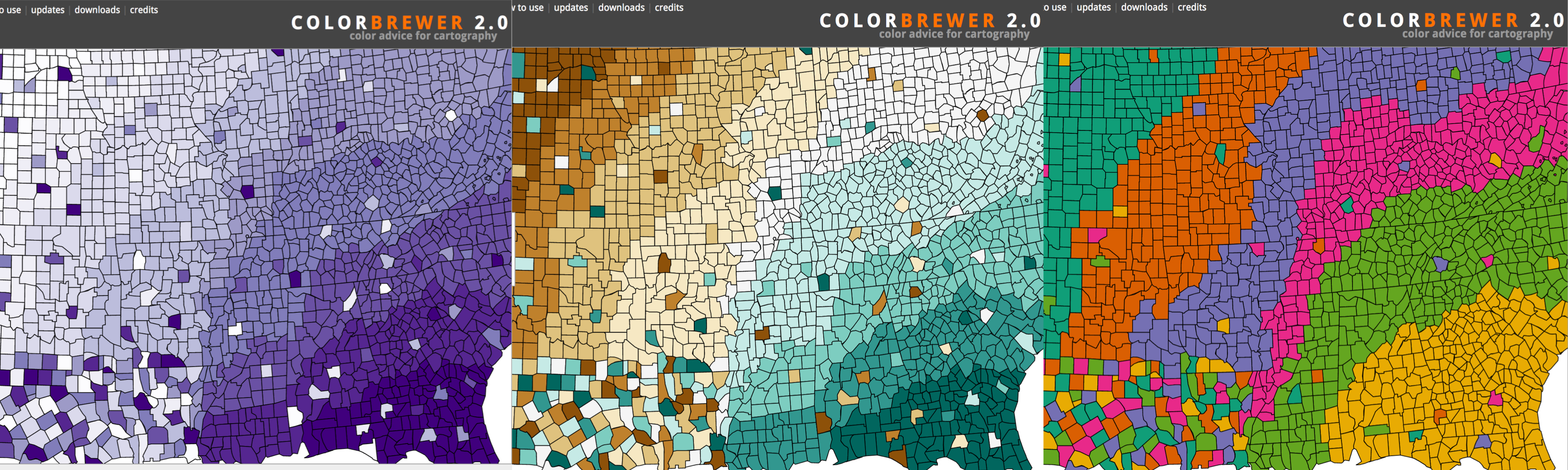
Some aesthetics are ordinal. Some are not. Some can be both!
- Color palettes, for example, can be:
- Sequential: Ordered data with one direction
- Diverging: Ordered data with two directions
- Qualitative: No order to the data
Consideration: Consider variable type when picking the aesthetic mapping.
Our ability to perceive differences varies by aesthetic!
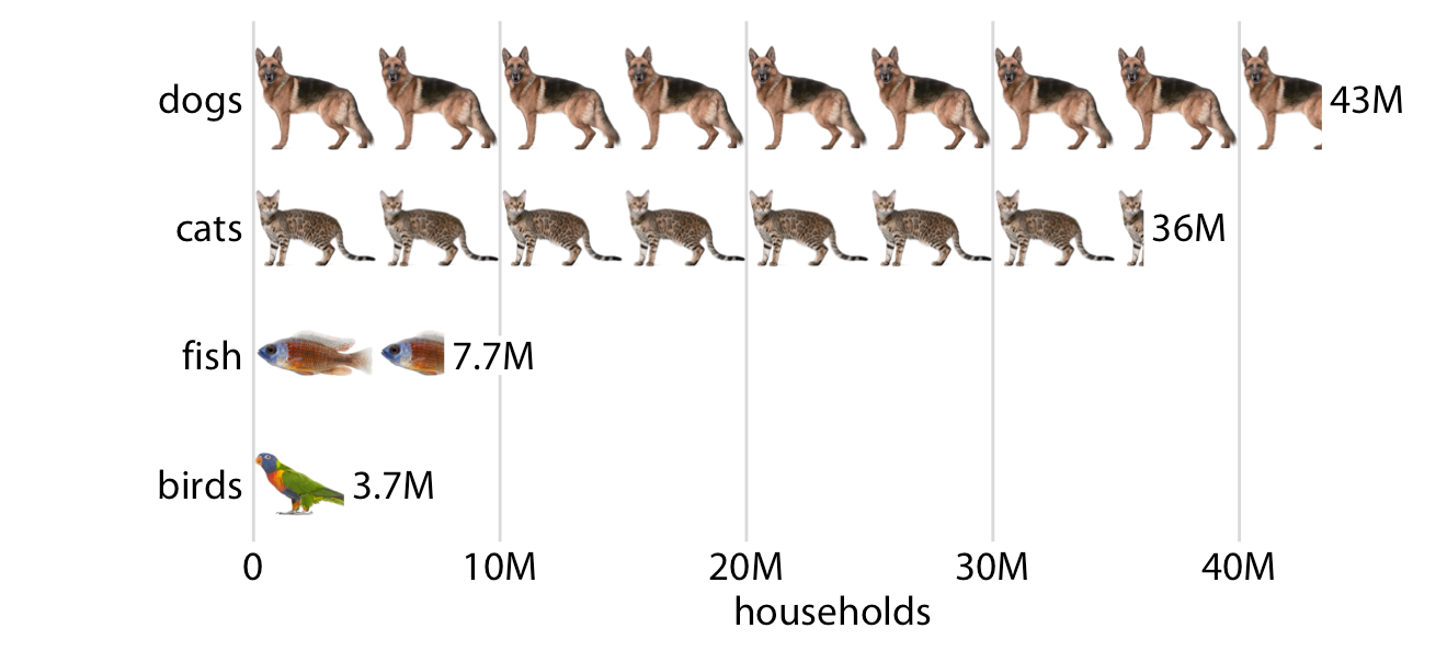
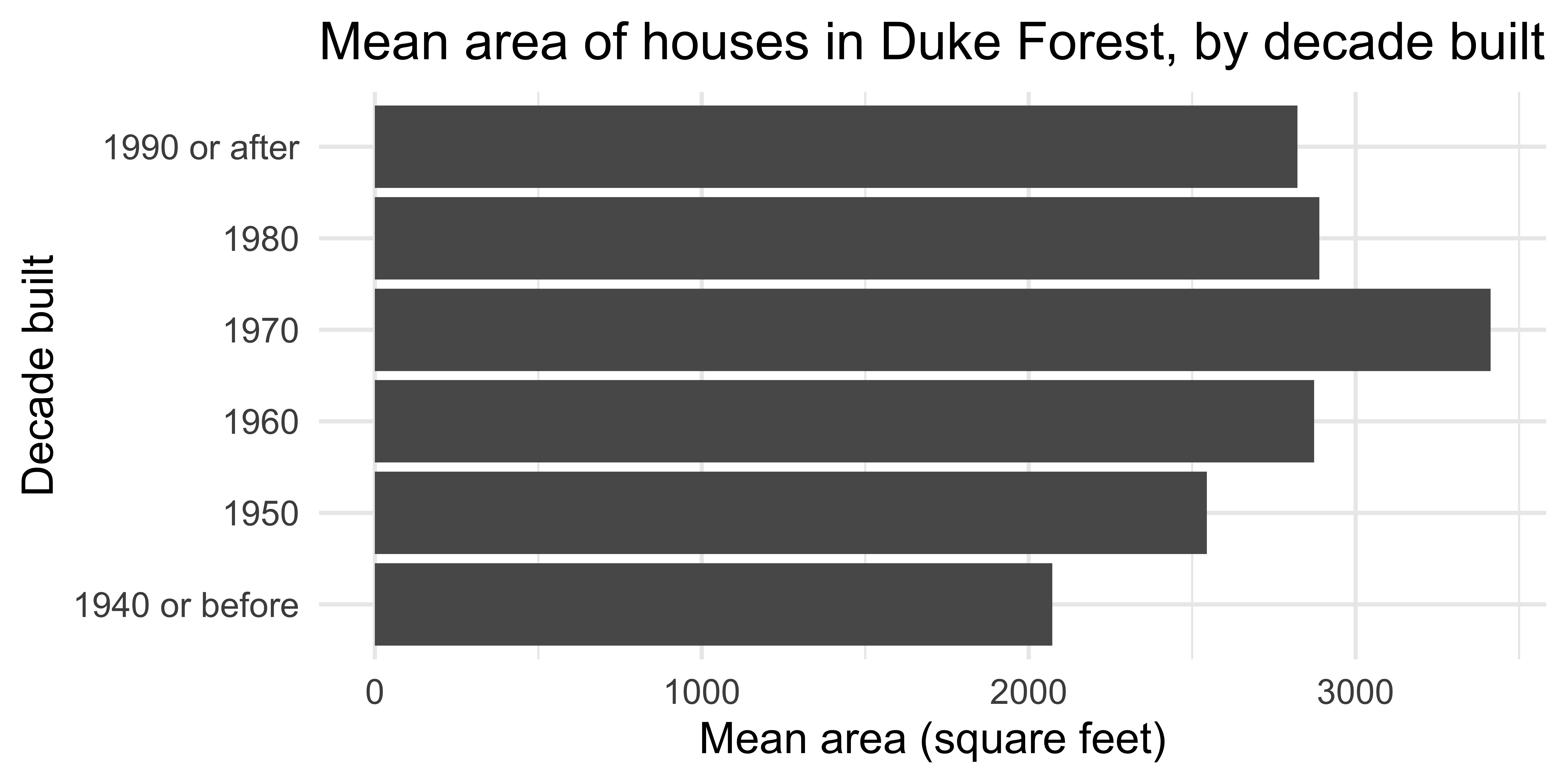
Consideration: Respect the principle of proportional ink.
Principle of proportional ink: The size of shaded areas need to be proportional to the data values they represent.
Consideration: Respect the principle of proportional ink.
Principle of proportional ink: The size of shaded areas need to be proportional to the data values they represent.
- Bars on a linear scale should start at 0.
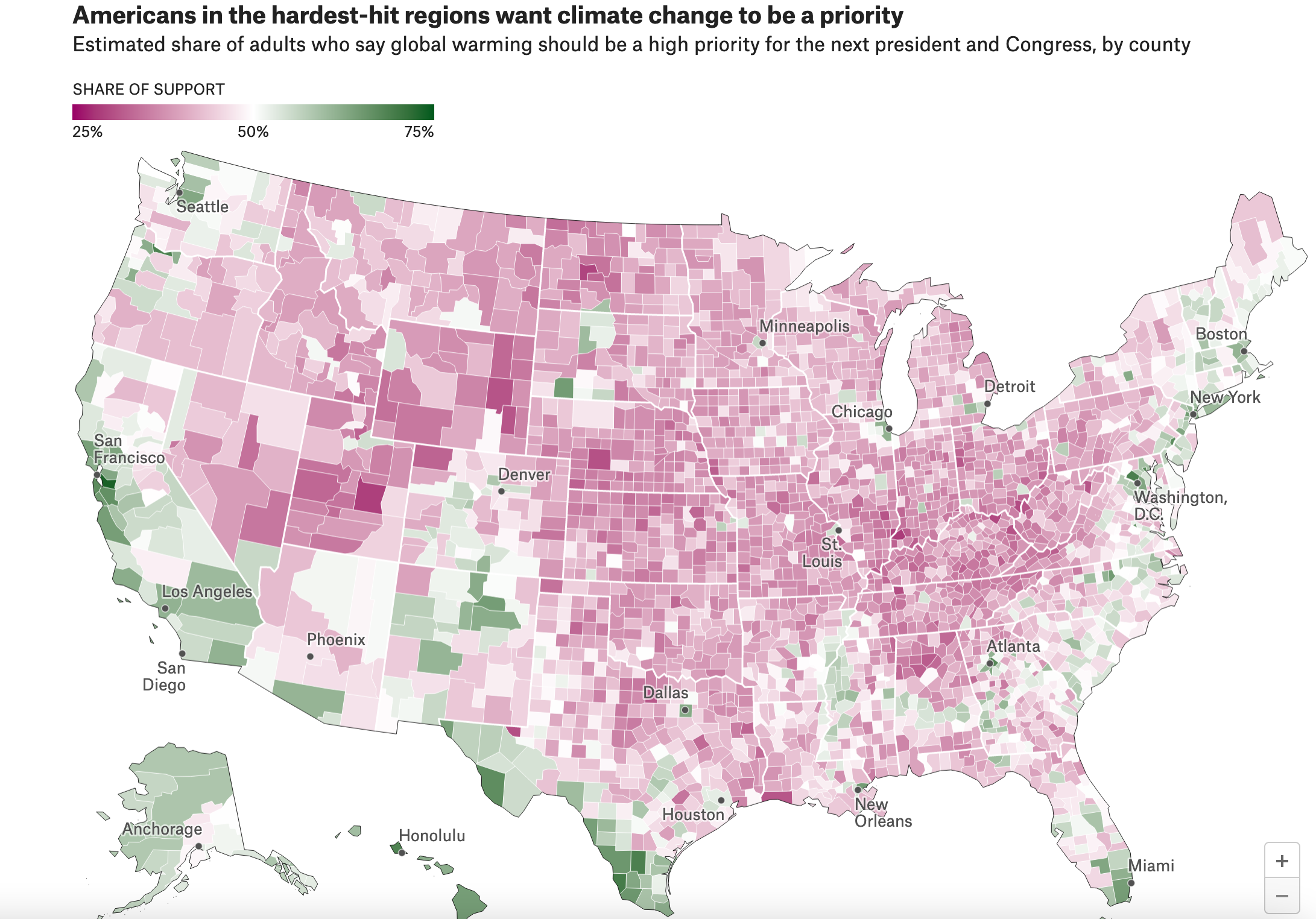
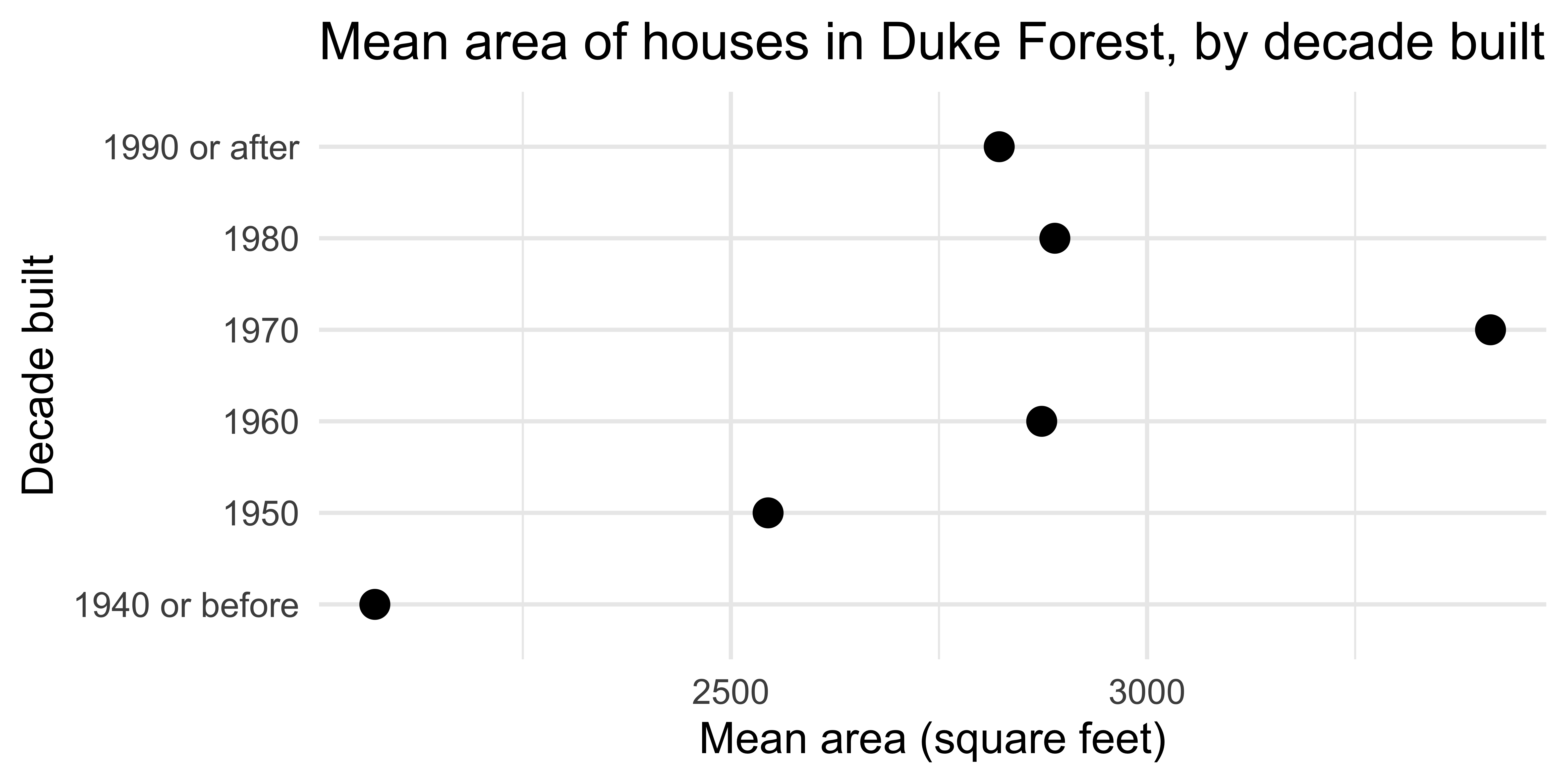
Consideration: Respect the principle of proportional ink.
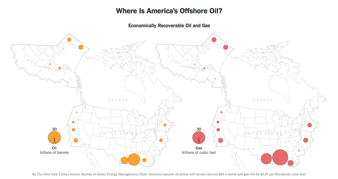
Difficult to respect with spatial data. Why?
Consideration: Respect the principle of proportional ink.
Instead of using geographic boundaries, pick a standardized shape and place “near” geographic location.
Consideration: Try to have a high data-ink ratio.
Data-ink ratio: “proportion of a graphic’s ink devoted to the non-redundant display of data-information.” – Edward Tufte
Credit: Mine Çetinkaya-Rundel
Consideration: Think carefully about context.
Consider including:
- Title (or Figure Caption)
- Subtitle with maker and data source
- Caption with key points
- Legends/helpers (with units)
- Axis labels (with units)
- Other annotations or reference points
What to add depends greatly on the research question or the story you are telling!
Consideration: Think carefully about context.
Consider including:
- Title (or Figure Caption)
- Subtitle with maker and data source
- Caption with key points
- Legends/helpers (with units)
- Axis labels (with units)
- Other annotations or reference points
Context should add both memorability and clarity.
Consideration: Simplify as much as you can.
Faceting is a great way to add another variable without over-complicating your graphic.
But only add additional variables that are useful to the story!
Consideration: Simplify as much as you can.
Over-plotting is very common in the Age of Big Data!
Example from my own work with the US Forest Inventory and Analysis Program

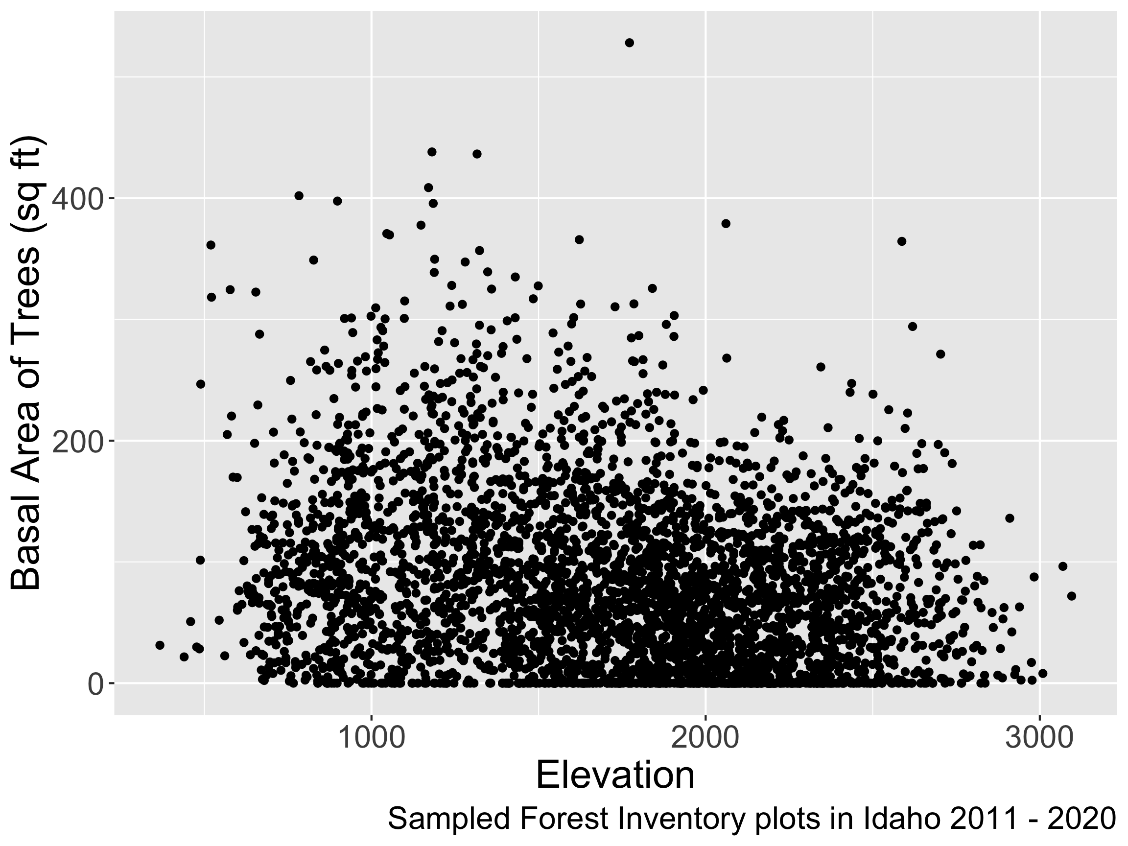
- Jitter the points.
Consideration: Simplify as much as you can.
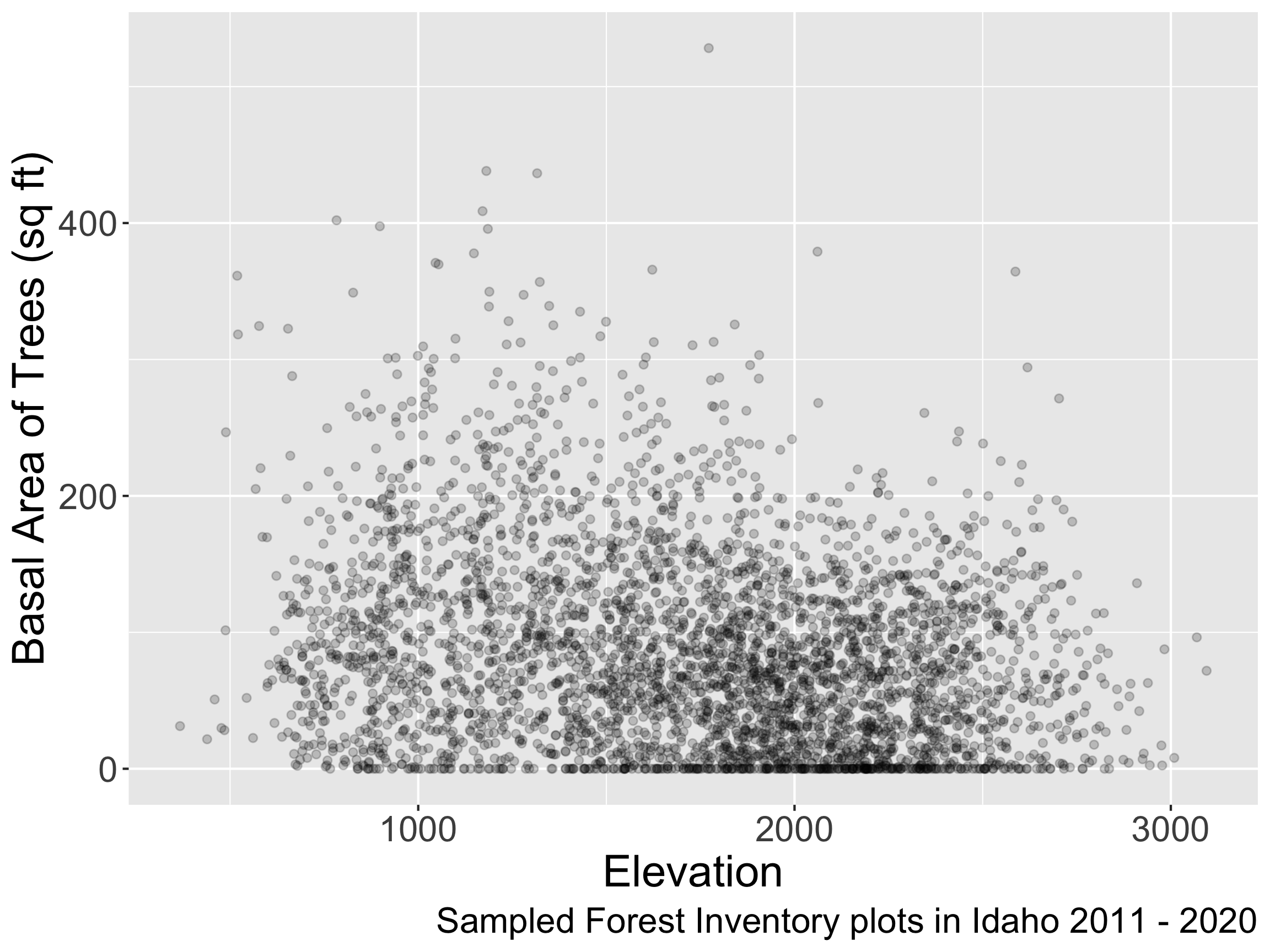
- Add transparency.
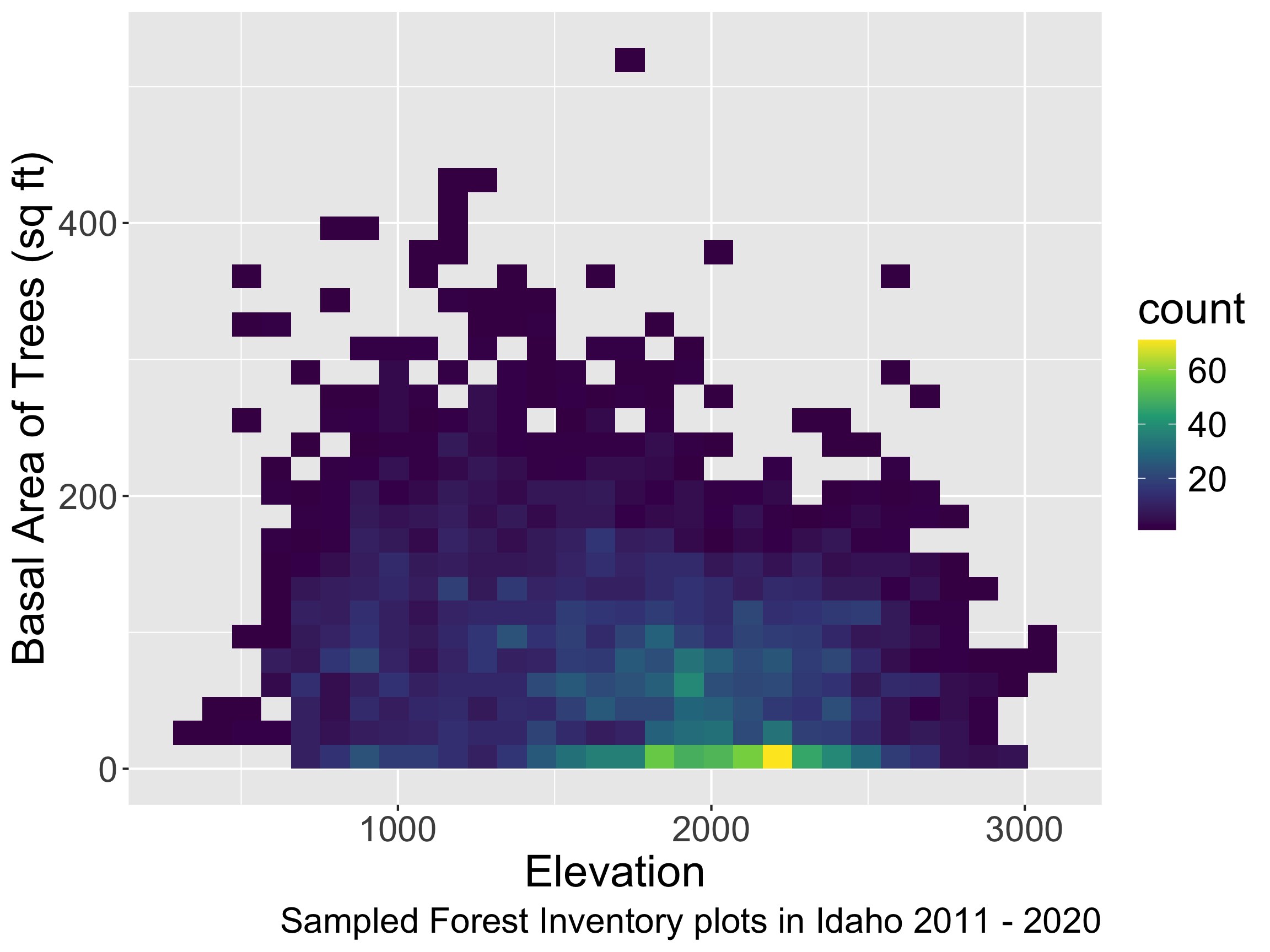
- Bin the data and then try a different
geom.
Pros and cons of different approaches?
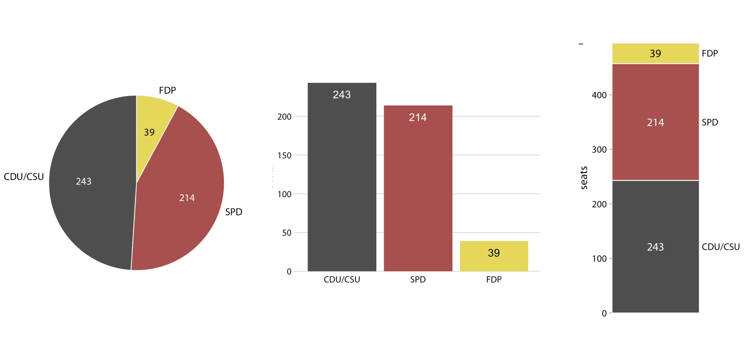
Consideration: Make important comparisons easy.
Which graph makes it easy to conclude that the ruling coalition (FDP + SPD) have a majority?
Consideration: Make important comparisons easy.
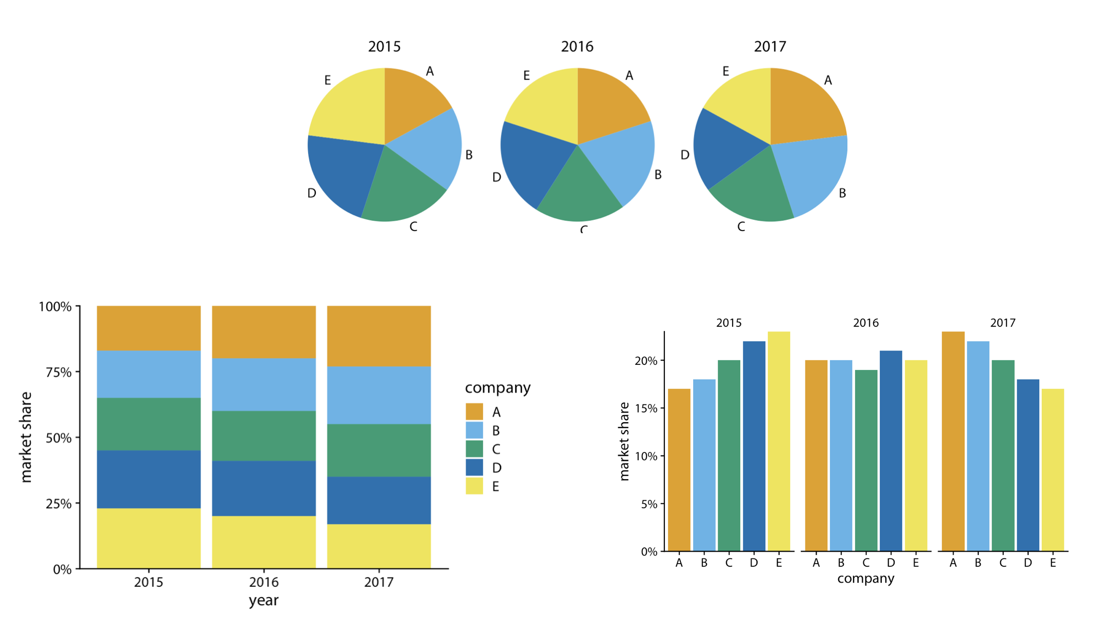
Which graph makes it easy to see how a company’s market share changes over time? (Warning: Fake data.)
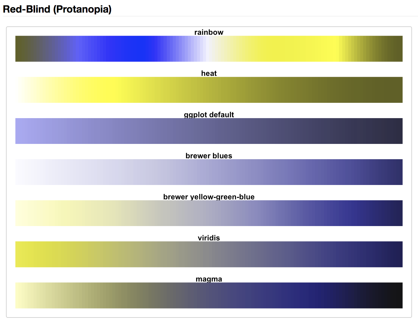
Consideration: Make your graphs accessible!
Not all R color palettes have been vetted for color blindness.
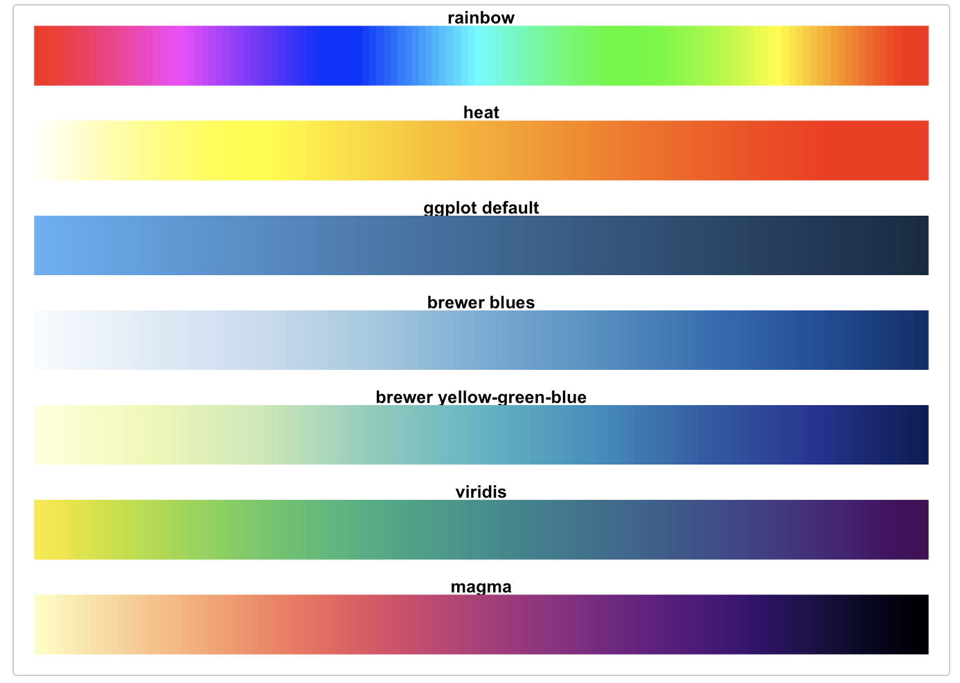
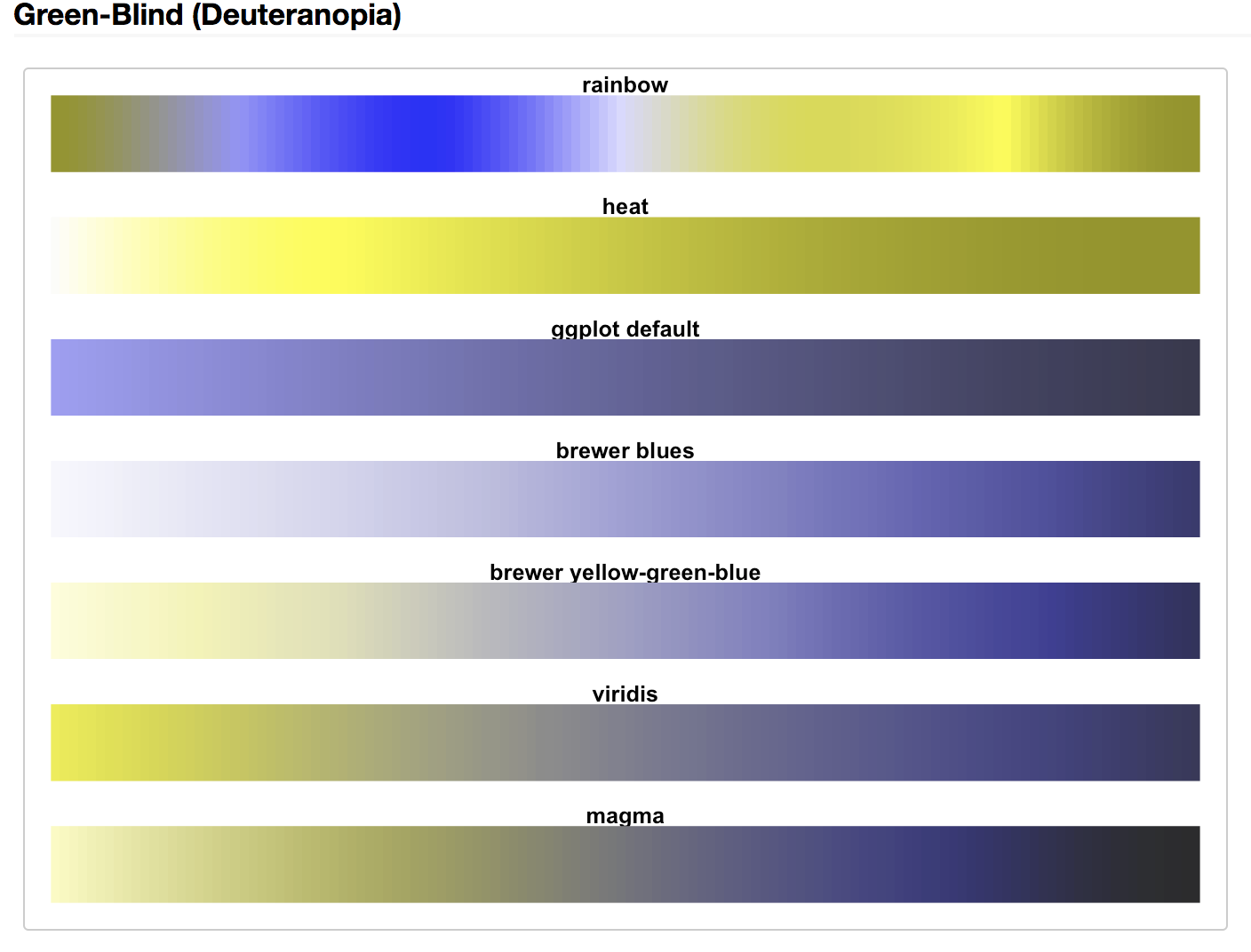
Consideration: Make your graphs accessible!
Not all R color palettes have been vetted for color blindness.
Consideration: Make your graphs accessible!
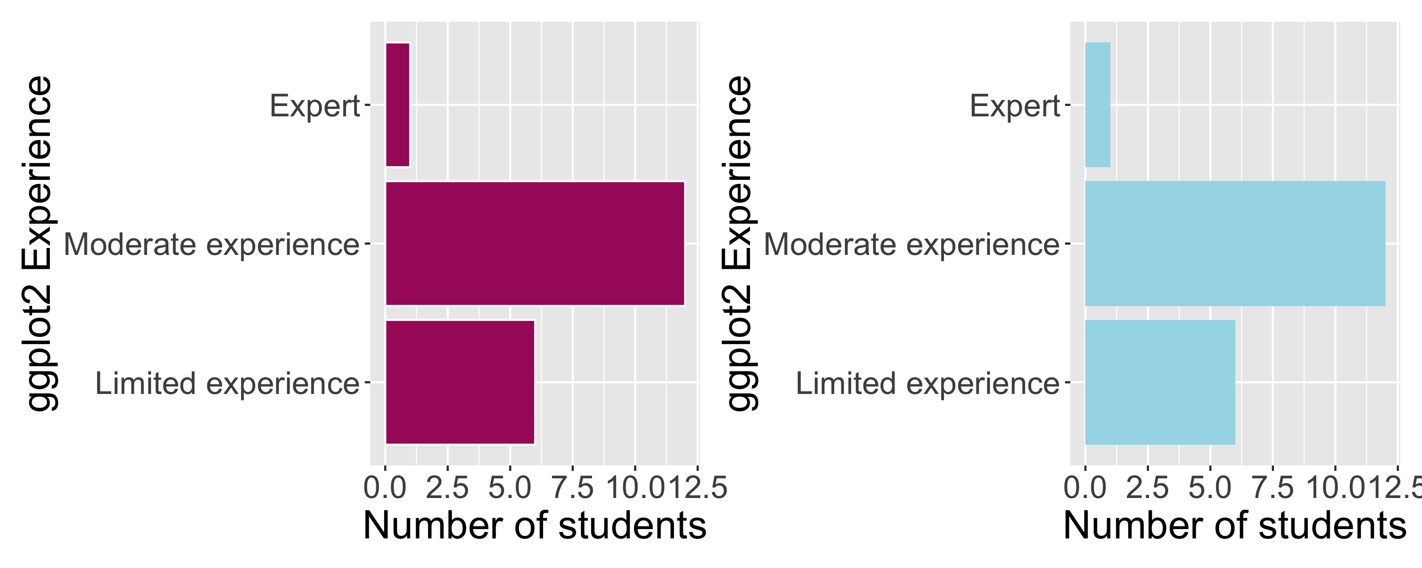
- Color contrast also matters.
- Shoot for a ratio of 4.5 or higher between overlapping colors.
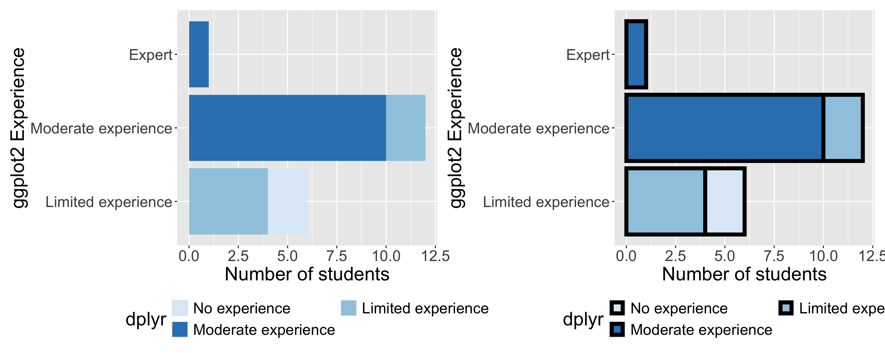
Consideration: Make your graphs accessible!
Use white space to help separate elements.
Consideration: Make your graphs accessible!
Use a large enough font size!